Vital Sparks is a non-profit that helps to aid women in disadvantaged countries to start their own businesses. The spark of hope for those who lack the rich opportunities present in other cultures.
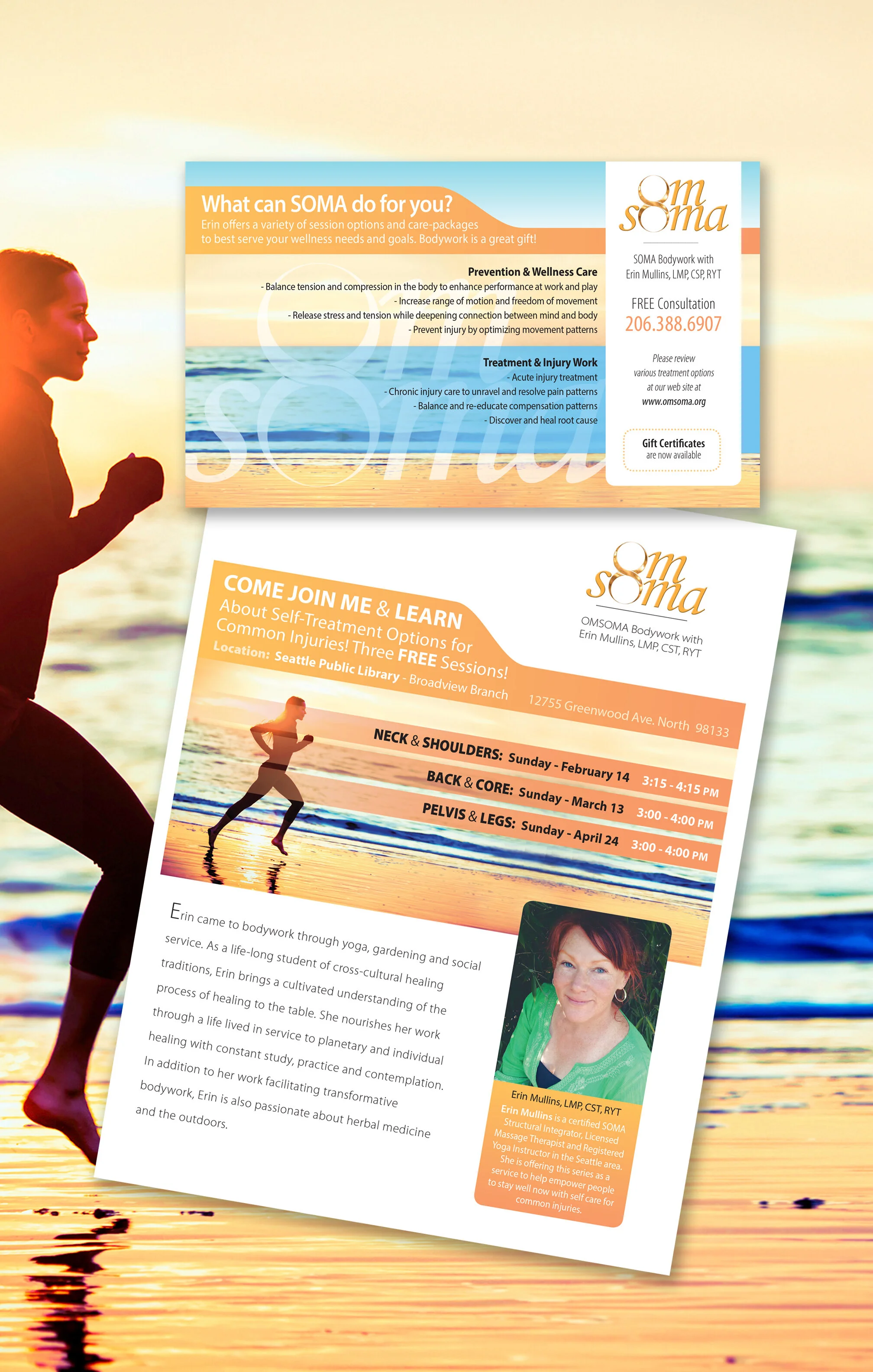
The OMSOMA Bodyworks owner needed a promotional piece to advertise her expertise. We took her pre-existing logo and rearranged copy from an older postcard to emphasize the strengths of her practice. We enlarged the size of her self-mailer and were able to use it as an ad, poster and mailer using one design.
American Seafoods wanted to feature a new product in an upcoming international trade show. Caviar from pollock was to emphasize its elegance and taste. The contemporary box housed a sample jar and small booklet as a take-away to potential B2B customers.
Ocean Resources International developed a new line of seafood products from North Pacific Seafoods. We created a logo and package design for their fresh frozen seafood products.
American Seafoods creates a beautiful calendar each year as a thank you to their customers and partners. From rich source waters, they sustainably harvest a quality catch which is managed responsibly to feed people globally. Each month displays photos showing clear evidence of what it’s like at sea.
Proctor Company offers comprehensive financial solutions for small business with exceptional depth. We paired the site design to their pre-existing brand development.
American Marine Ingredients requested a brochure for their brand new line of powdered spices with remarkable freshness and flavor. The beautiful fish illustration was created by Bruce Morser.
Spektor Dental captured the sought-after Best Dentist / Best Cosmetic Dentist 425 Award for seven years in a row. Spektor Dental capitalized on solid and consistent branding with honest testimonials one smile after another. Dr. Wendy Spektor loves her patients and gives them the best care possible. She also has offered seminars for other medical professionals about the value of marketing their practice. Her example clearly paid off.
My client approached me with a request for a new product logo. He created an innovative fin for paddle boards. The name of his product was Frogfish. This is an actual species that changes color according to the background as a means of protection. I took this very survival feature as a big-picture solution. The fish would remain the same shape and expression, but the surface of the fish body could change in color and pattern as needed for each new product line.
The founder of Rice Nutrition needed to upgrade their logo. The concept was great. We just needed to add more confidence, color and presence to the mark. This would be an example of a logo font design. There is no icon to this logo. Many times, a logo can be created by just using the name only.